¶ Accommodation API Statistics
This report is designed to see the hotel statistic information. The filters that can be applied in most reports are the following:
-
Real Time, Hours, Days and Weeks: It allows to filter by the statistics of the current day or statistics filtered by hours, days and weeks. The maximum number of days that can be considered is the one corresponding to the length of a month.
-
Customer: It allows to filter the search requests by customer.
-
Supplier: It allows to filter the search requests by supplier.
-
Zone: It allows to filter by the request destination area.
-
Request Type: It allows to filter by the type of request that has been made.
-
Interface: It allows to filter by the environment where the search has been made (XML, CLC, etc.).
-
Availability Type: It allows to filter by the availability type that has been obtained in the hotel searches (Multi-hotel, One-hotel, Zone or Unknown).
-
Nationality: It allows to filter by the nationality of the passenger.
-
Destination: It allows to filter by the destination area of the passenger.
-
Context: It allows to filter by the request context.
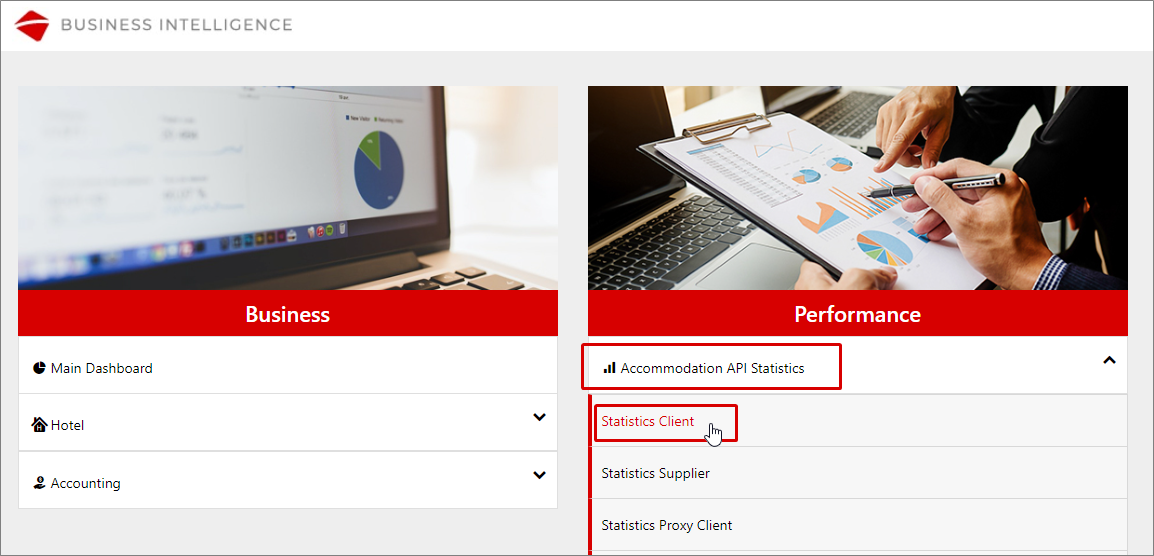
¶ Accommodation API Statistics Client
This report shows statistic information about the flow of requests made by the agencies. It offers dashboards focused on different targets to facilitate the monitoring of some fields like the response times, the errors that occurred or the proper conversion of each agency, among others.
In the upper part of each dashboard, you will be able to use different filters and select the dates of your choice from the horizontal time axis (by keeping it pressed and dragging during the desired period). The maximum period you can filter is 30 days.
It is also possible to activate the scroll of the charts by selecting Configuration > Zoom, filtering the data of a specific chart by pressing the desired values from the legend or using the View Full Screen option by pressing the three horizontal stripes that are found in the upper-right part of each chart.
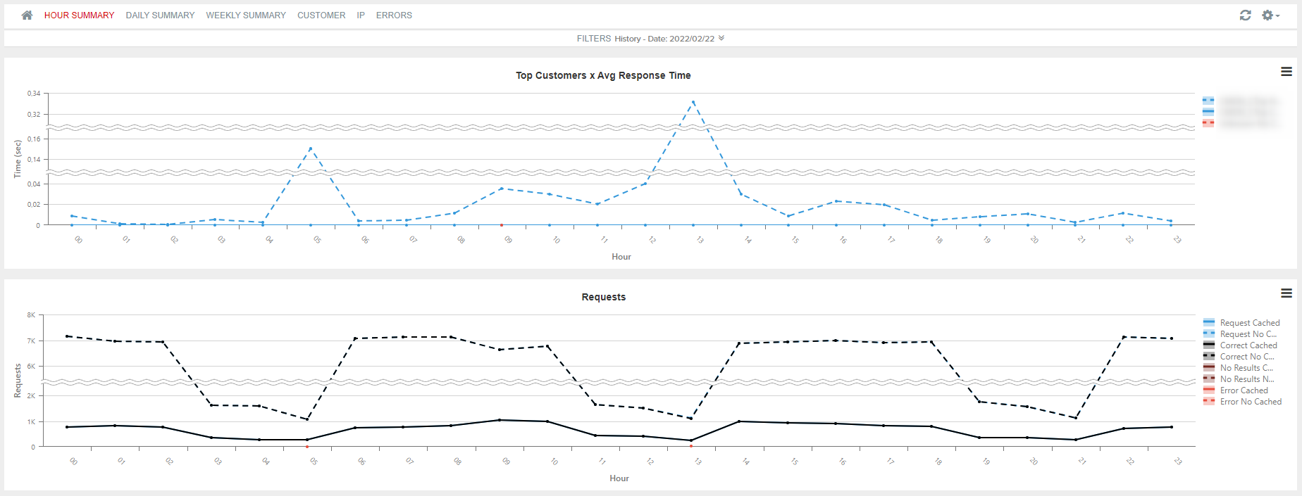
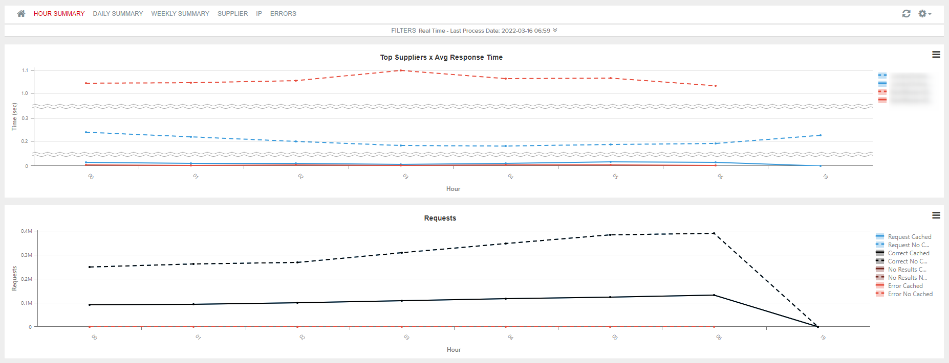
Tab 1: Hour Summary
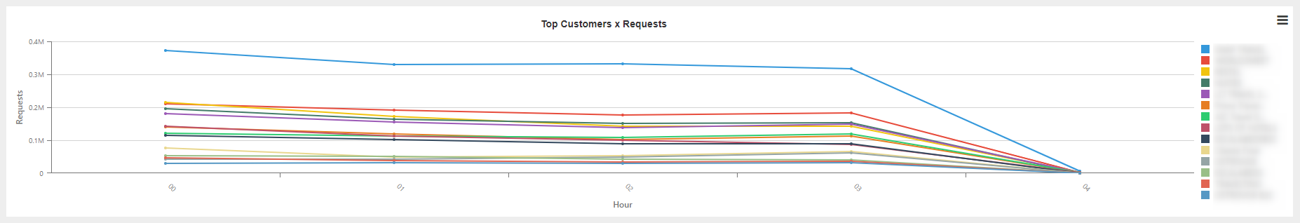
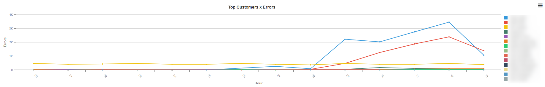
Trend of the requests of each agency broken down by hour. The dashboard is composed of the following charts:
- Top Customer x Avg Response Time: Average response time of a request per hour and agency.

- Requests: Number of transactions per hour according to the responses returned.

- Hotel Ratio Results: Number of hotels requested and hotels returned per hour.

- Top Customer x Requests: Agencies with the highest number of requests per hour.
- Top Customer x Errors: Agencies with the highest number of errors per hour.
- Request x Request Type: Breakdown of the total number of requests according to the type of request.
- Requests x interface: Breakdown of the requests according to the interface.

Tab 2: Daily Summary
Trend of the statistic requests of each agency broken down by day. The charts that make up this dashboard are the same as in the previous case.
Tab 3: Weekly Summary
Same information as on the previous tabs broken down by week.
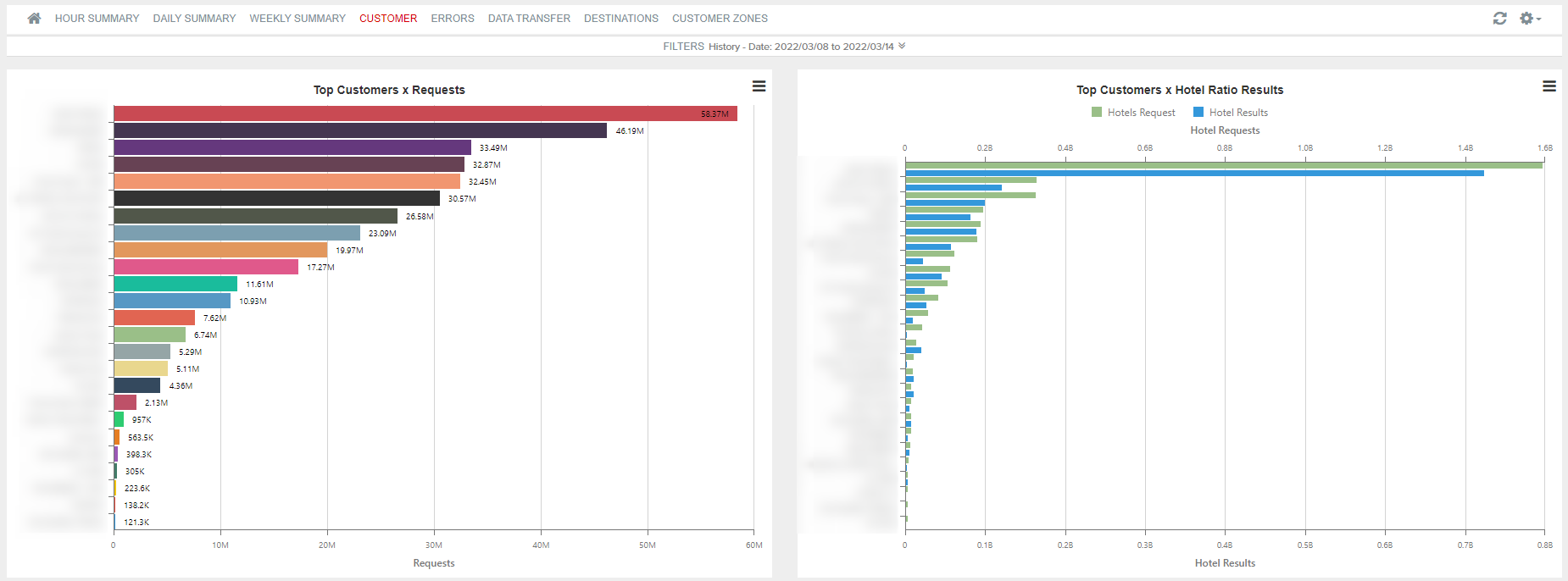
Tab 4: Customer
Thanks to this report, you can obtain information about the requests performed for each of the agencies and about which of them have a better proportion between the number of requests and bookings made. The dashboard is composed of the following charts:
- Top Customer x Requests: Number of requests per agency.
- Top Customer x Hotel Ratio Results: Number of hotel requests and requests returned per agency.
- Top Customer x Worst L2B: Number of availability requests among number of booking requests per agency.
- Top Customer x Errors: Number of errors obtained per agency.

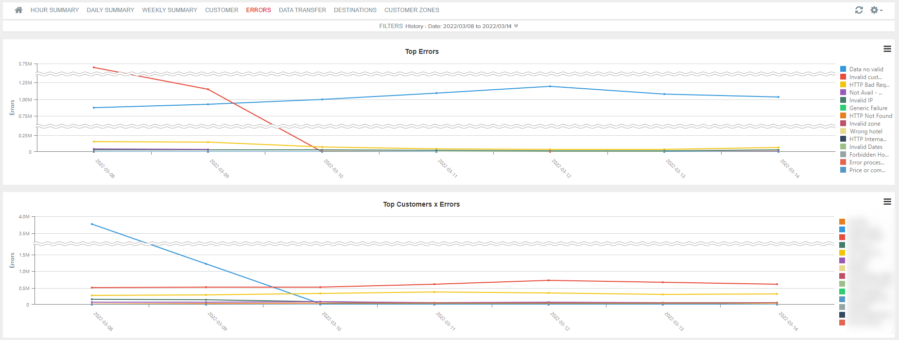
Tab 5: Errors
Detail of the errors returned to each of the agencies. The dashboard is composed of the following charts:
- Top Errors: Top errors returned broken down per day.
- Top Customer x Errors: Agencies with the highest number of errors returned.
- Top Requests x IP: Breakdown of the IPs having the highest number of wrong requests.
- Errors x Error Type: Breakdown through the type of error returned from the wrong requests.
- Errors x Request Type: Number of wrong requests according to the type of request.

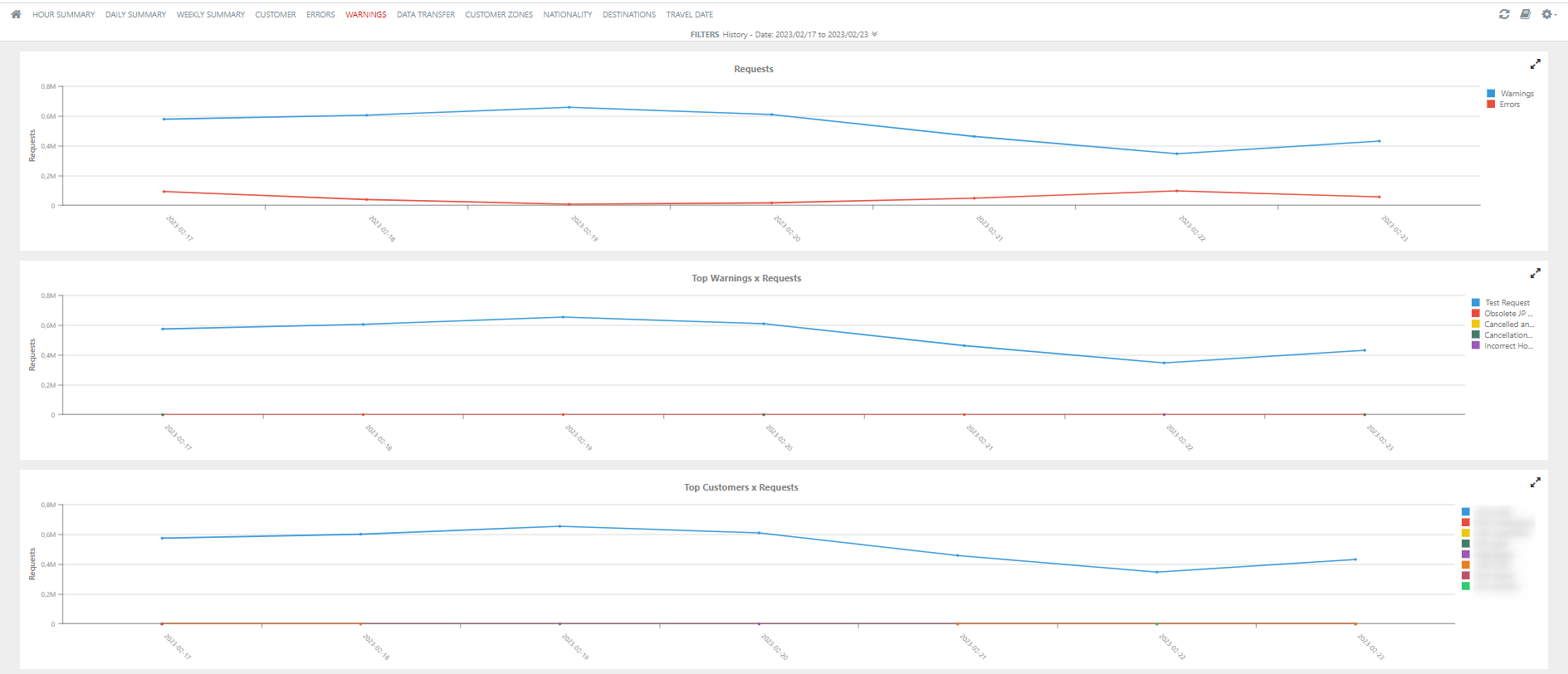
Tab 6: Warnings
Distribution of Warnings in Booking Rule and Booking step. Remember that if more than one warning is returned in a request, only the first one is shown in the statistics.
- Requets: Number of Warnings and errors.
- Top Warnings x Requests: List of the top warnings returned.
- Top Customers x Requests: Shows the customers that have the highest number of warnings returned.
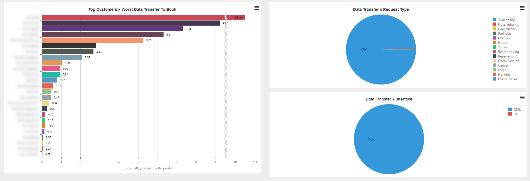
Tab 7: Data Transfer
Trend of the data transfer usage. The dashboard is composed of the following charts:
- Data Transfer Trend: Data transfer usage per day.
- Top Customer x Data Transfer: Trend of data transfer used per each agency.

- Top Customers x Worst Data Transfer To Book: List of agencies with the worst proportion of data transfer per bookings.
- Data Transfer x Request Type: Number of requests according to the type of request.
- Data Transfer x Interface: Number of requests according to the interface.
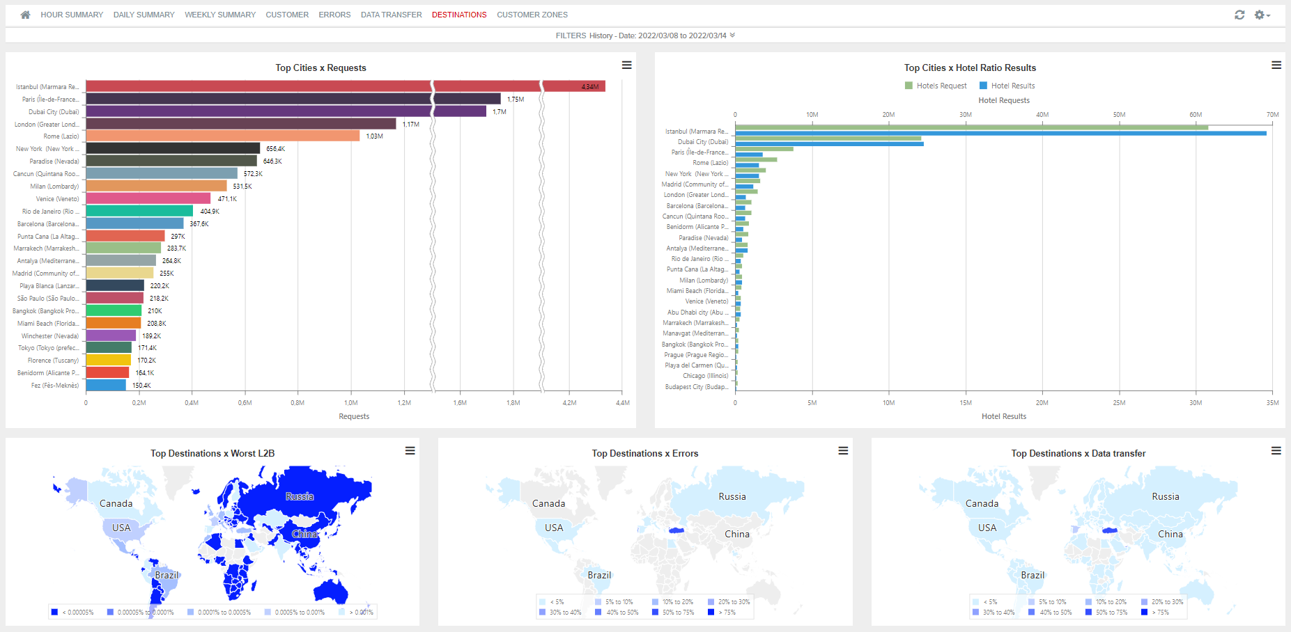
Tab 8: Destination
Statistics broken down by destination areas. The dashboard is composed of the following charts:
- Top Cities x Requests: Areas with the highest number of requests.
- Top Cities x Hotel Ratio Results: Hotels requested and hotels returned in each of the areas.
- Top Destinations x Worst L2B: Comparison between the number of availability requests and booking requests in each area (L2B).
- Top Destinations x Errors: Percentage of errors according to each destination area.
- Top Destinations x Data Transfer: Percentage of data transfer used by area.
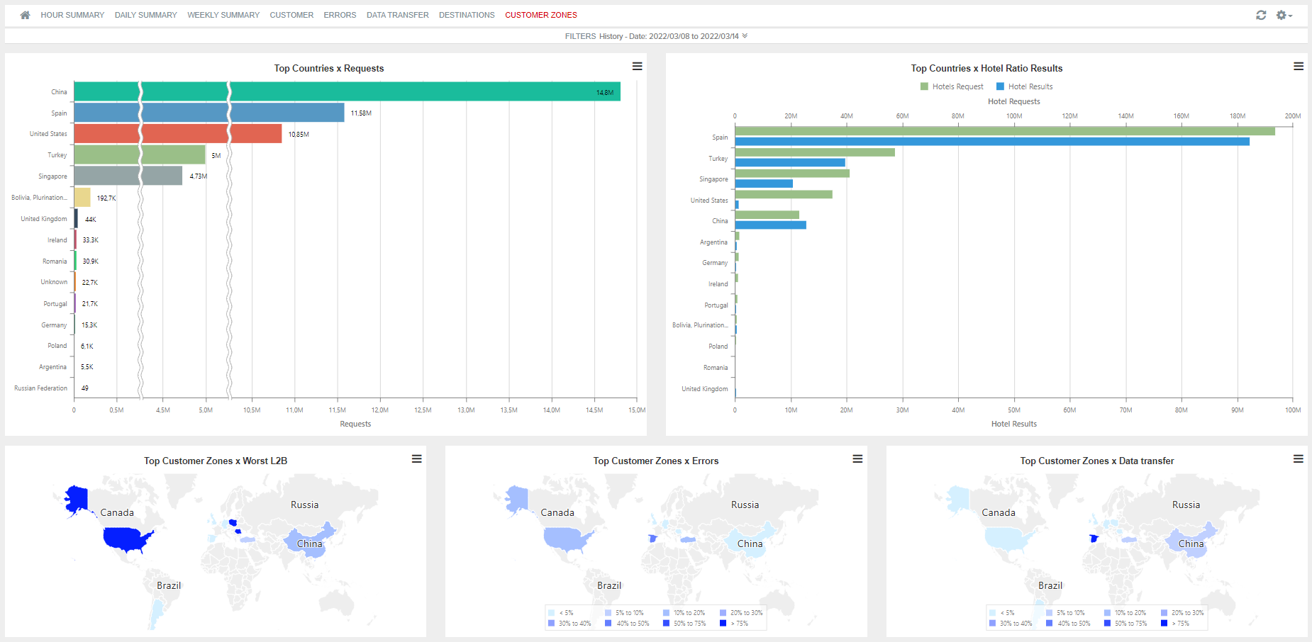
Tab 9: Customer Zones
Statistics broken down by the origin area of the request. The screen is composed of the following charts:
- Top Countries x Requests: Countries that produce a higher number of requests.
- Top Countries x Hotel Ratio Results: Hotels requested and returned in each of the origin areas of the request.
- Top Customer Zones x Worst L2B: Comparison between the number of availability requests and booking requests in each area (L2B).
- Top Customer Zones x Errors: Percentage of errors according to each area.
- Top Customer Zones x Data Transfer: Percentage of data transfer used by area.
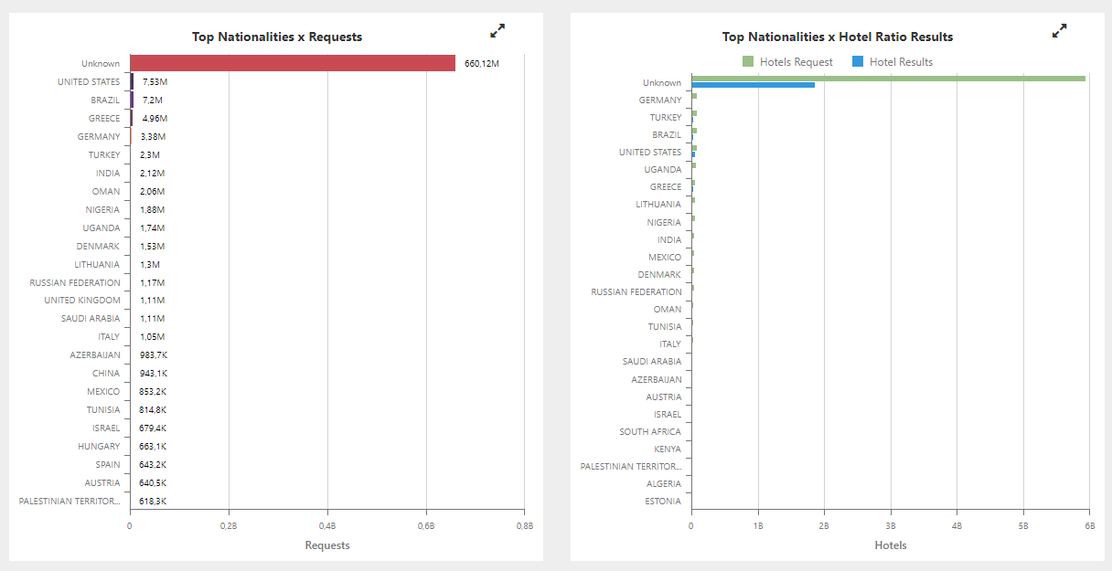
Tab 10: Nationality
The statistics are displayed according to the nationality of the passengers and the destination area. Some of the points that can be defined by means of this tab are the following:
- Main nationality of the passengers.
- Define the destinations that happen to be more interesting for each market.
- Find out if some of the markets encounter availability difficulties.
The tab is composed of the following charts:
- Top Nationalities/Destinations x Requests: It shows the nationality and destination for each transaction made.
In this case, the nationality of the passenger appears to the left of the chart and the destination country, to the right.

To obtain more details regarding the destinations grouped by "Other", the bar indicated should be clicked on.

-
Top Nationalities x Requests: It indicates the nationalities that have made the most transactions.
-
Top Nationalities x Hotel Ratio Results: It shows the ratio of hotels requested and returned by nationality.
-
Top Nationalities x Worst L2B: It indicates on a map the proportion of bookings according to the number of requests made per nationality.
-
Top Nationalities x Errors: Proportion of errors according to the nationality of the passenger that made the transaction.

Tab 11: Travel Date
This report allows to view the travel dates that are being requested per customer and nationality. It also shows if the quantity of right responses is the one expected for the travel dates requested.
This report is composed of the following charts:
- Requests: It represents the total quantity of requests made, distinguishing them between those that have been correctly responded (some of the request hotels are available) and those that have not, according to the date of the request.

Thanks to this chart, you can define which dates have the least availabilty and how long in advance your customers tend to book.
- Top Customers x Requests: This chart allows you to view and analyse how long in advance each of the travel agencies try to book.

- Top Nationalities x Requests: It shows which weeks have the most hotel requests per host nationality.

- Top Destination Zones x Requests: This chart allows to define which weeks are more interesting for each destination area.

¶ December 2024 1
Real Time
The activation of minute-by-minute and second-by-second reports requires internal configuration. For more information, please contact your Project Manager.
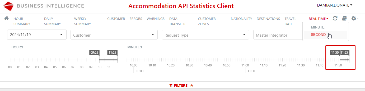
In the Accommodation API Statistics > Statistics Client > REAL TIME menu, you will find a sub-menu that allows you to choose to view reports by minute or by second:
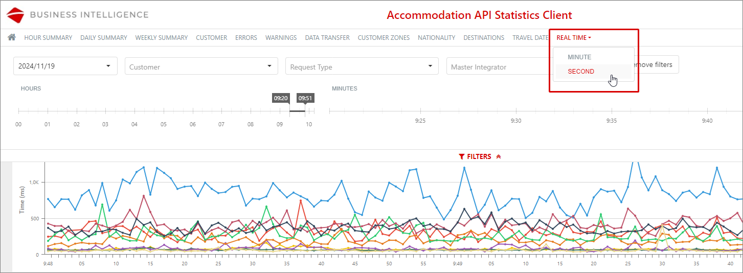
Real time by minute
Information is gathered in two-hour periods by the system, which caches it for quick access.
Initially, data from the last two hours will be retrieved, and as the data in the cache expands, the hours in the selector will be extended until a full day is achieved (the data for a full day is loaded in less than five minutes):

Filters
A maximum of two hours can be selected for filtering, which improves the visibility of the information. Functioning of the hour selector:
If the filtering for the last two hours has been done, the filter is automatically updated as the minutes pass:


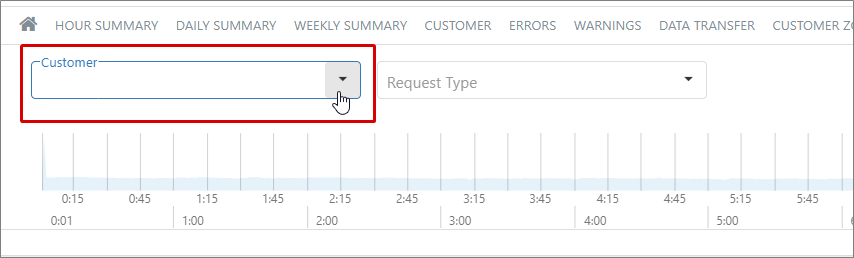
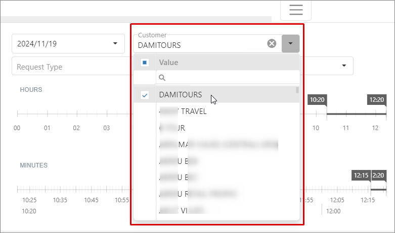
In addition to filtering by hours, the option to filter by client can be found through the Customer dropdown menu…
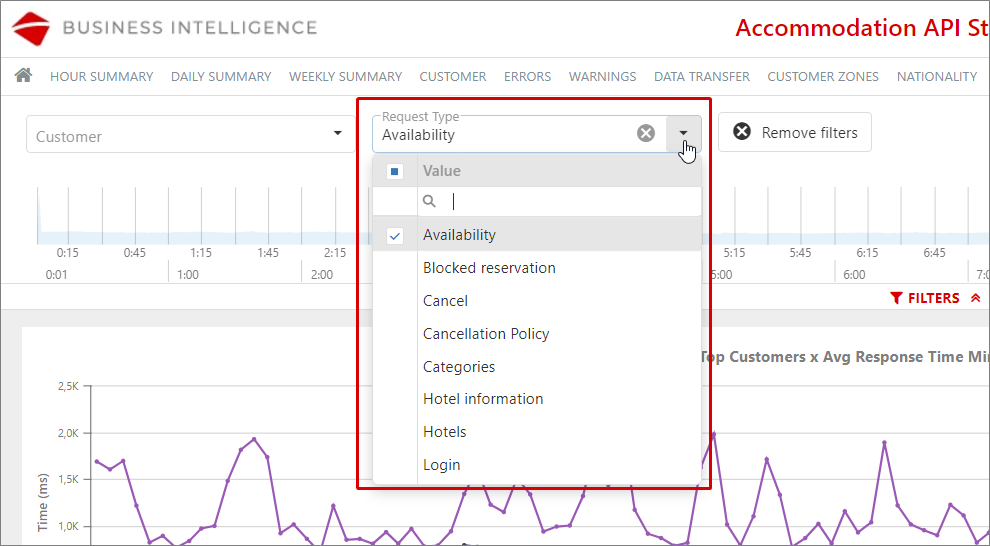
… and by response type, through the Request Type selector:
Graphs
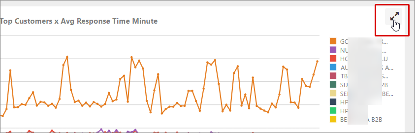
- Top Customers x Avg Response Time Minute: Shows the response time of the customers with the most requests in the selected period:

In all the graphs, you will find an option that allows you to obtain more details; simply click the two opposite arrows shown in the top right corner of the graph, and a new window will open in the browser:
New window with the graph details:

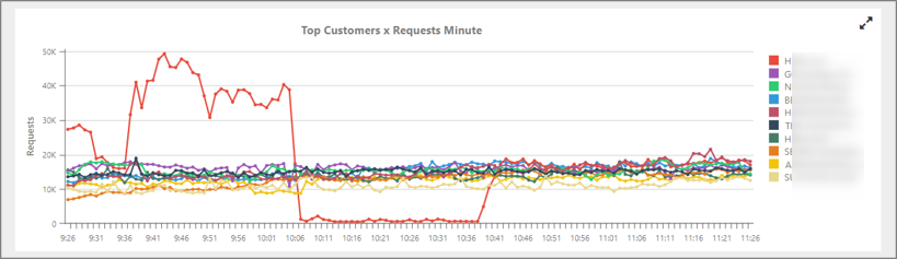
- Top Customers x Requests Minute: Shows the customers with the highest number of booking requests during the time period you have selected:
- Requests Minute: Represents the total volume of requests made during the selected period, visually differentiating between correct and incorrect results:

- Hotel Ratio Results Minute: Visually displays the number of requested hotels and the number of hotels retrieved per minute, during the selected time period:

- Data Transfer Mbytes Minute: Shows, in megabytes, the amount of data consumed in your Data Transfer per minute during the filtered period:

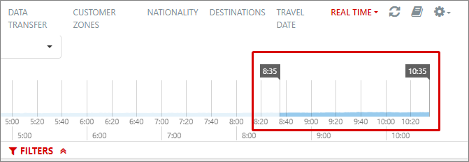
Real time by second
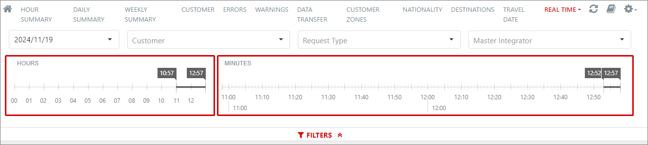
Only periods of up to five minutes can be filtered in this report, and it will always be within the time period previously selected, which, by default, will be the last two hours relative to the current time:
Filters
- Day: A day can be selected from the last seven displayed in descending order using this dropdown. By default, the current date will be selected:

- Customer: Allows a specific customer to be selected to obtain their report:
- Request type: Allows filtering by request type:

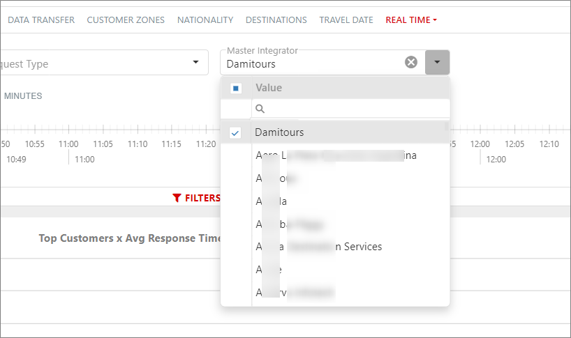
- Master Integrator: If filtered by a specific Master Integrator, and the booking request information does not indicate it, the filter will consider the IP addresses related to the Master Integrator selected in the filter:
-
Hours: A maximum range of two hours can be selected. By default, the last two hours relative to the current time are pre-selected.
-
Minutes: The previously selected period in the hour selector is shown and allows selecting up to five minutes. This period will also be updated in real-time on the screen as the minutes pass:
Graphs
- Top Customers x AVG Response Time Second: Shows the response time, in milliseconds, of the customers with the most requests in the selected period:

- Top Customers x Requests Second: Shows the customers with the highest number of booking requests in the selected period:

- Top IP x AVG Response Time Second: Shows the response time, in milliseconds, of the IP addresses with the most requests in the selected period:

- Top IP x Requests Second: Shows the IP addresses with the highest number of requests in the selected period:

- Requests Second: Represents the total volume of requests made during the selected period:

¶ Accommodation API Statistics Supplier
This report shows the same information as the previous one except that, in this case, by supplier.
In the upper part of each dashboard, you will be able to use different filters and select the dates of your choice from the horizontal time axis (by keeping it pressed and dragging during the desired period). The maximum period you can filter is 30 days.
It is also possible to activate the scroll of the charts by selecting Configuration > Zoom, filtering the data of a specific chart by pressing the desired values from the legend or using the View Full Screen option by pressing the three horizontal stripes that are found in the upper-right part of each chart.
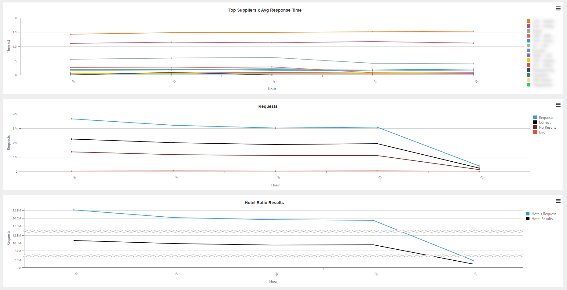
Tab 1: Hour Summary
Trend of the statistic requests of each agency broken down by hour. The dashboard is composed of the following charts:
- Top Supplier x Avg Response Time: Average response time of a request per hour and supplier.
- Requests: Number of transactions per hour according to the responses returned.
- Hotel Ratio Results: Number of hotels requested and hotels returned per hour.
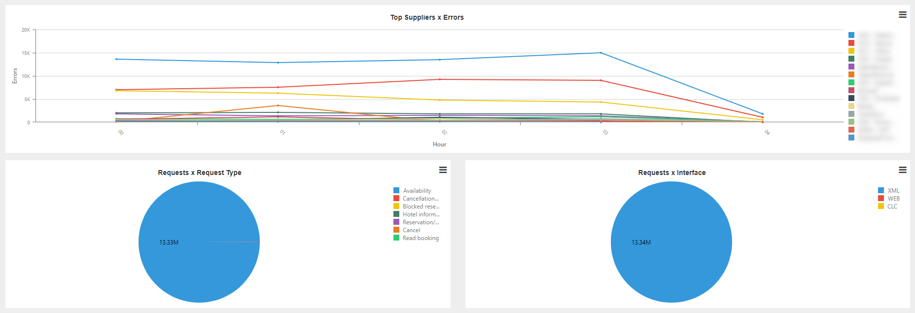
- Top Supplier x Errors: Suppliers with the highest number of errors per hour.
- Request x Request Type: Breakdown of the total number of requests according to the type of request.
- Requests x Interface: Breakdown of the requests according to the interface.
Tab 2: Daily Summary
Trend of the statistic requests of each supplier broken down by day. The charts that make up this dashboard are the same as in the previous case.
Tab 3: Weekly Summary
Same information as on the previous tabs broken down by week.
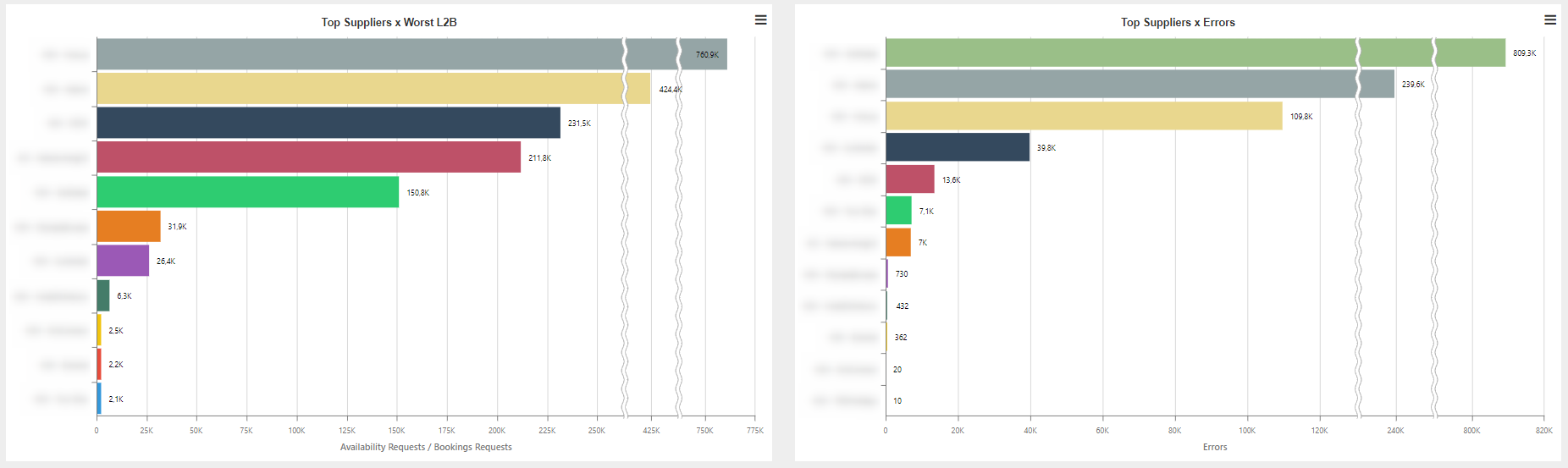
Tab 4: Supplier
Thanks to this report, you can obtain information about the requests performed for each of the suppliers and about which of them have a better proportion between the number of requests and bookings made. The dashboard is composed of the following charts:
- Top Supplier x Requests: Number of requests per supplier.
- Top Supplier x Hotel Ratio Results: Number of hotel requests and requests returned per agency.
- Top Supplier x Worst L2B: Number of availability requests among number of booking requests per supplier.
- Top Supplier x Errors: Number of errors obtained per supplier.

Tab 5: Credential
This report shows the same information as on the previous tab, except that it is broken down by the supplier credential.
Tab 6: Customer
Thanks to this report, you can obtain information about the requests performed for each of the agencies and about which of them have a better proportion between the number of requests and the bookings made. The dashboard is composed of the following charts:
- Top Customer x Requests: Number of requests per agency.
- Top Customer x Hotel Ratio Results: Number of hotel requests and requests returned per agency.
- Top Customer x Worst L2B: Number of requests among number of booking requests per agency.
- Top Customer x Errors: Number of errors obtained per agency.


Tab 5: Errors
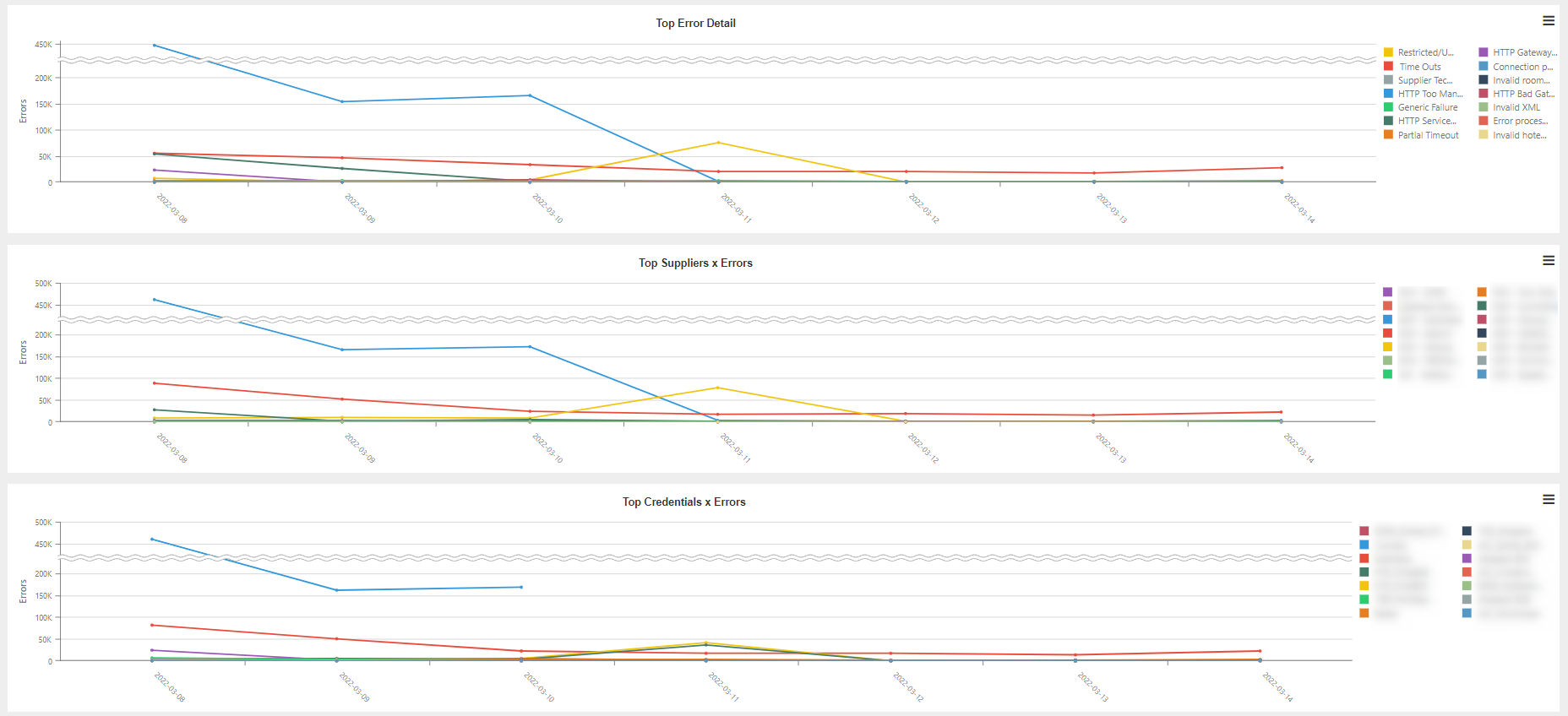
Detail of the errors returned by each of the suppliers. The dashboard is composed of the following charts:
- Top Error Detail: Top errors returned by the suppliers, broken down per day.
- Top Supplier x Errors: Suppliers that return the highest number of errors.
- Top Credential x Errors: Supplier credentials that return the highest number of errors.
- Errors x Request Type: Number of wrong requests according to the type of request.
- Error x Error Type: Errors returned by the suppliers.
- Top Error x Error Detail: Detail of the errors returned by the suppliers.

Tab 6: Errors detail
Detail of the errors returned by the suppliers. The dashboard is composed of the following charts:
- Top Supplier x Errors: Suppliers with the highest number of errors.
- Top Credential x Errors: Supplier credentials with the highest number of errors.
- Top Customer x Errors: Agencies with the highest number of supplier errors.

- Top Error Type x Errors: Most common types of error.
- Top Detail Error Type x Errors: Detail of the most common errors.
- Top Supplier Error Type x Errors: Error responses from the most common suppliers.

¶ Accommodation API Statistics Client Proxy
This report reflects the statistic information related to the flow of requests performed by the agencies having Proxy. It includes dashboards focused on different targets to facilitate the monitoring of many fields.
Tab 1: Hour Summary
Trend of the requests of each agency broken down by hour. The dashboard is composed of the following charts:
- Top Customer x Avg Response Time: Average response time of a request per hour and agency.
- Requests: Number of transactions per hour according to the responses returned.
- Top Customer x Errors: Agencies with the highest number of errors per hour.
- Data Transfer: Breakdown of the data transfer usage according to whether or not the requests are cached.

Tab 2: Daily Summary
Trend of the statistic requests of each agency broken down by day. The charts that make up this dashboard are the same as in the previous case.
Tab 3: Weekly Summary
Same information as on the previous tabs broken down by week.
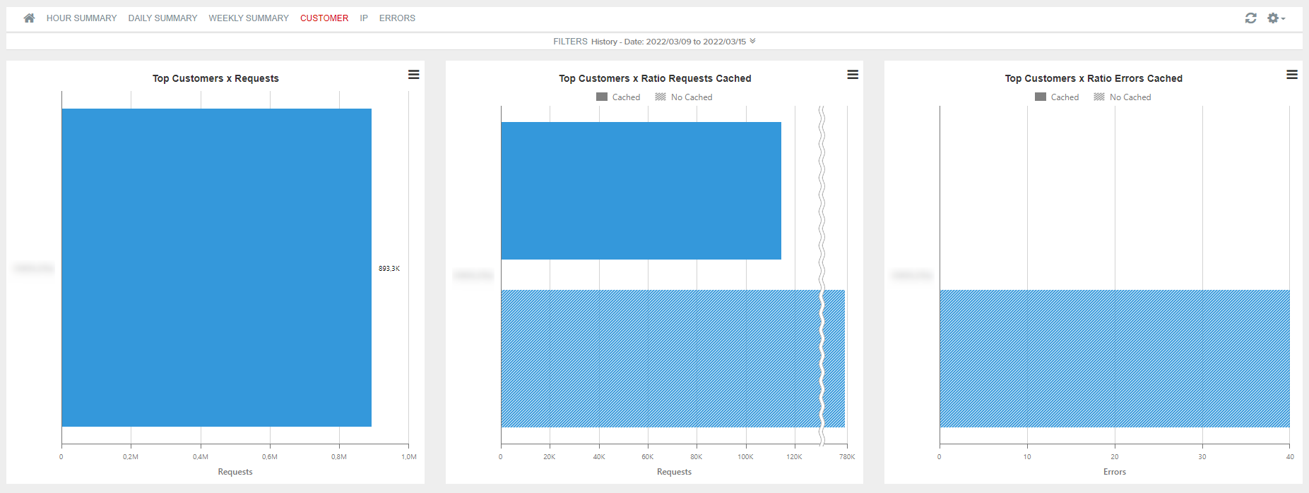
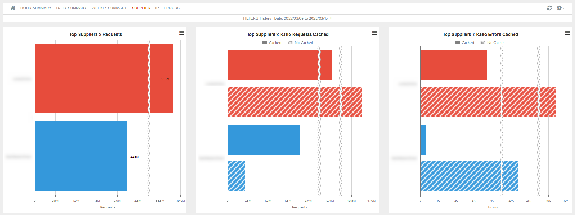
Tab 4: Customer
Thanks to this report, you can obtain information about the requests performed for each of the agencies and about which of them have a better proportion between the number of requests and bookings made. The dashboard is composed of the following charts:
- Top Customer x Requests: Number of requests per agency.
- Top Customer x Ratio Requests Cached: Breakdown of the requests performed in Cached and Not cached.
- Top Customer x Ratio Errors Cached: Number of errors according to whether or not the request has been cached.
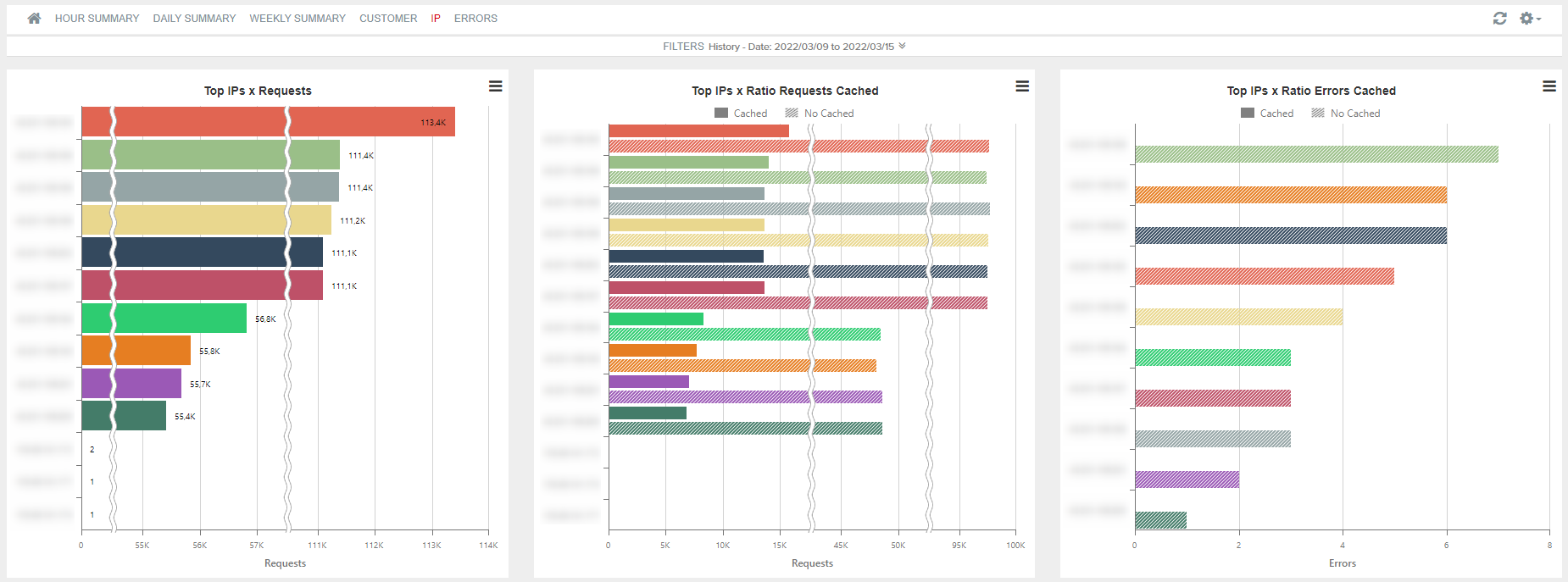
Tab 5: IP
It shows the information about the IPs of those clients with Proxy.
- Top IPs x Requests: It shows the IPs that perform most requests.
- Top IPs x Ratio Requests Cached: It breaks down the IPs that have performed a higher number of requests between Cached and Not cached.
- Top IPs x Ratio Errors Cached: It quantifies the number of errors according to the IP and whether the request was cached or not.
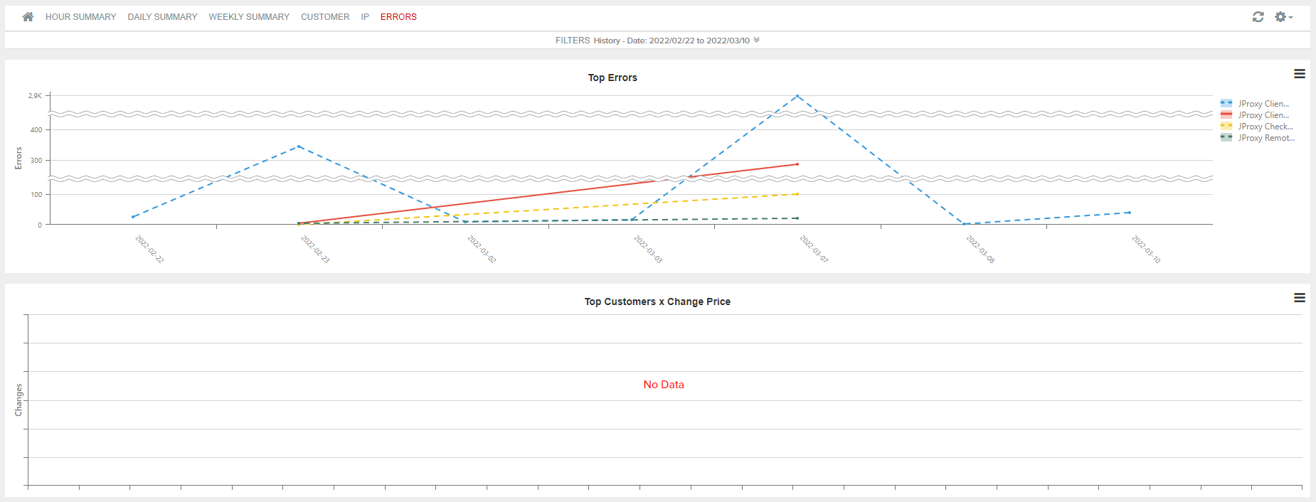
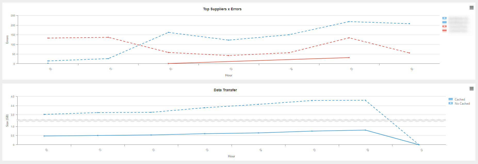
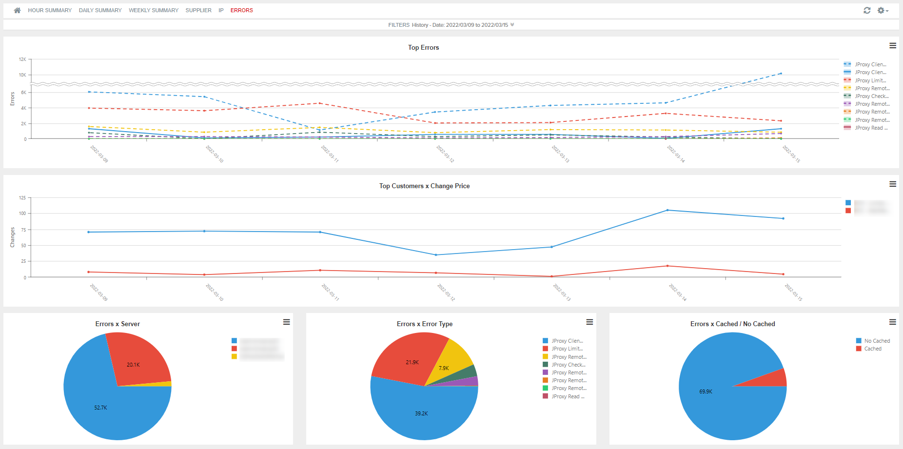
Tab 6: Errors
It shows the errors made, broken down by type of error, server and whether or not the request is cached. The charts that make up the dashboard are the following:
- Top Errors: It shows the errors made according to the day and the type of error.
- Top Customers x Change Price: It determines the number of price changes performed per agency.
- Errors x Server: Number of errors made per server.
- Errors x Error Type: It shows the number of each type of error that was made.
- Errors x Cached/No Cached: Breakdown of the wrong requests in Cached request or Not cached request.

¶ Accommodation API Statistics Supplier Proxy
This report reflects the statistic information related to the flow of requests made by the suppliers having Proxy. It includes dashboards focused on different targets to facilitate the monitoring of the suppliers thanks to different fields.
Tab 1: Hour Summary
Trend of the requests of each agency broken down by hour. The dashboard is composed of the following charts:
- Top Suppliers x Avg Response Time: Average response time from each supplier per hour.
- Requests: Number of transactions per hour according to the responses returned by each supplier.
- Top Suppliers x Errors: Suppliers with the highest number of errors per hour.
- Data Transfer: Breakdown of the data transfer usage according to whether or not the requests are cached.
Tab 2: Daily Summary
Trend of the statistic requests of each supplier broken down by day. The charts that make up this dashboard are the same as in the previous case.
Tab 3: Weekly Summary
Same information as on the previous tabs broken down by week.
Tab 4: Supplier
Thanks to this report, you can obtain information about the requests performed for each of the suppliers and about which of them have a better proportion between the number of requests and bookings made. The dashboard is composed of the following charts:
- Top Suppliers x Requests: Number of requests per agency.
- Top Suppliers x Ratio Requests Cached: Breakdown of the requests performed in Cached and Not cached.
- Top Suppliers x Ratio Errors Cached: Number of errors according to if the request has been cached.
Tab 5: IP
It shows information about the IPs of those suppliers with Proxy.
- Top IPs x Requests: It shows those IPs that make the most requests.
- Top IPs x Ratio Requests Cached: It breaks down those IPs that have made the highest number of requests in Cached and Not cached.
- Top IPs x Ratio Errors Cached: It quantifies the number of errors according to the IP and whether or not the request was cached.

Tab 6: Errors
It shows the errors made by each supplier, broken down by type of error, server and whether or not the request is cached. The charts that make up the dashboard are the following:
- Top Errors: It shows the errors made according to the day and type of error.
- Top Supplier x Change Price: It determines the number of price changes performed per agency.
- Errors x Server: Number of errors made per server.
- Errors x Error Type: It shows the number of each type of error that has occurred.
- Errors x Cached/No Cached: Breakdown of the wrong requests in cached or not cached request.
¶ Hotel Statistics Client
This report shows statistical information about hotel requests by your integrators and agencies.
From the top of each dashboard you have the possibility to filter by different items and, on the horizontal chronological axis, select the dates that interest you (holding down and dragging during the desired period).
You also have the possibility to activate the scroll of the graphics from the upper right by selectiong Settings > zoom, filter the data of a specific graphic by clicking on the desired values in the legend or use View Full Screen option clicking on the three horizontal lines located on top right side of the figure.
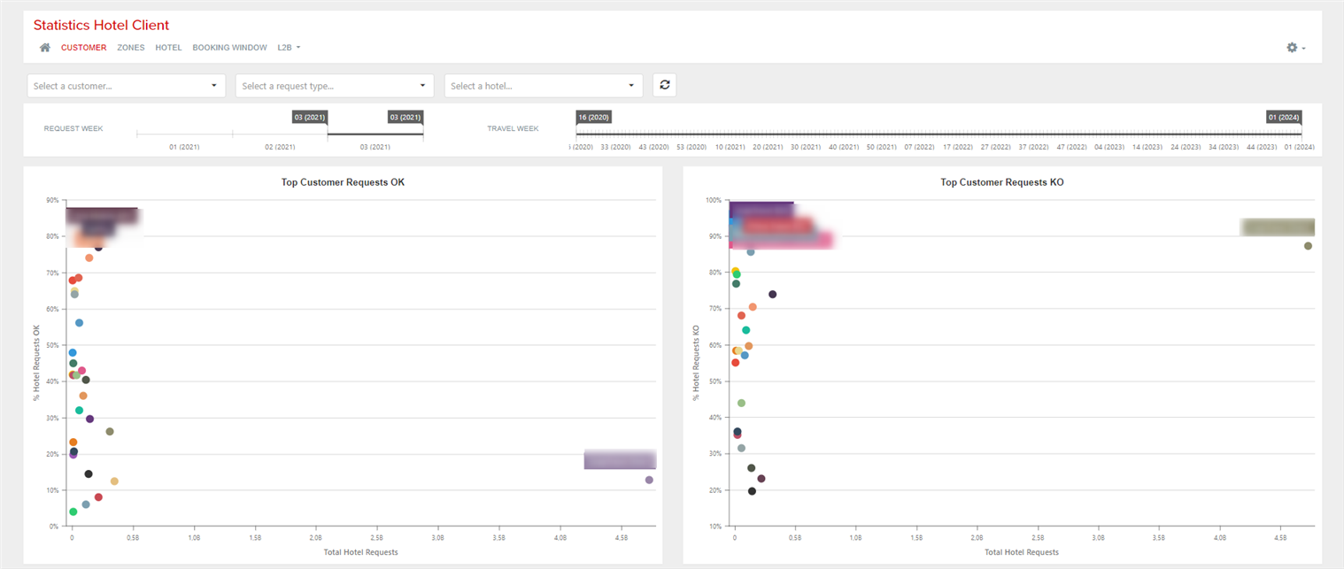
Tab 1: Customer
This report shows statistical information about requests made by agencies.
- Top Customer Requests OK: The chart shows the top 25 customers with the most total hotel requests and hotel requests OK. It shows, for each one, the percentage of hotel requests OK and the number of total hotel requests.
- Top Customer Requests KO: The chart shows the top 25 customers with the most total hotel requests and hotel requests KO. It shows, for each one, the percentage of hotel requests KO and the number of total hotel requests.
- Requests Hotel OK: Top 150 contries with the highest number of correct responses. By hovering over the country, you can see the total number of requests and the percentage of correct ones, as well as the top 10 suppliers with the highest percentage of correct requests.
- Requests Hotel KO: Top 150 contries with the highest number of incorrect responses. By hovering over the country, you can see the total number of requests and the percentage of incorrect ones, as well as the top 10 suppliers with the highest percentage of incorrect requests.

Tab 2: Zones
Information for the cities with the highest percentage of OK and KO requests.


Tab 3: Hotel
Same information as in the previous reports referring to hotel requested.


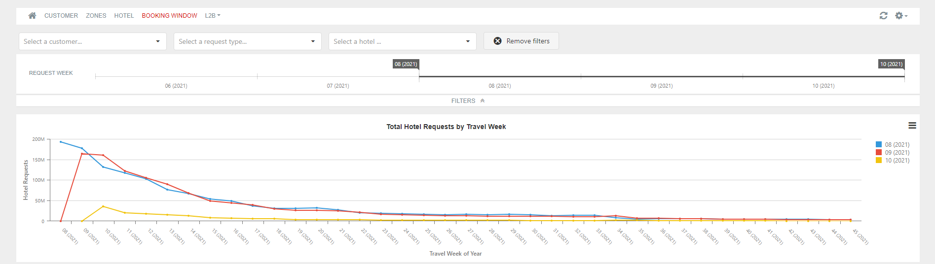
Tab 4: Booking Window
Total hotel requests information by travel week and percentage of correct and wrong requests.

Tab 5: L2B
This tab allows you to view the information related to the countries, cities/towns or hotels with the highest number of requests according to different criteria.
- Top Countries x Availability / Bookings Requests: countries with the highest number of availability requests per booking requests (it corresponds to the classic Look2Book).
- Top Countries x % Cancellation Requests vs Bookings: countries with the highest percentage of cancellation requests per bookings made.
- Top Countries x cancellation Policy / Bookings Requests: countries with the highest number of cancellation policy requests per booking requests.
- Top Countries x Availability / Cancellation Policy Requests: countries with the highest number of availability requests per cancellation policy requests.
The dashboards per cities/towns and hotels also appear in the same way as that of the countries mentioned above.


¶ Hotel Statistics Supplier
This report shows statistical information about hotel requests to your suppliers and the responses obtained.
From the top of each dashboard you have the possibility to filter by different items and, on the horizontal chronological axis, select the dates that interest you (holding down and dragging during the desired period).
You also have the possibility to activate the scroll of the graphics from the upper right by selectiong Settings > zoom, filter the data of a specific graphic by clicking on the desired values in the legend or use View Full Screen option clicking on the three horizontal lines located on top right side of the figure.
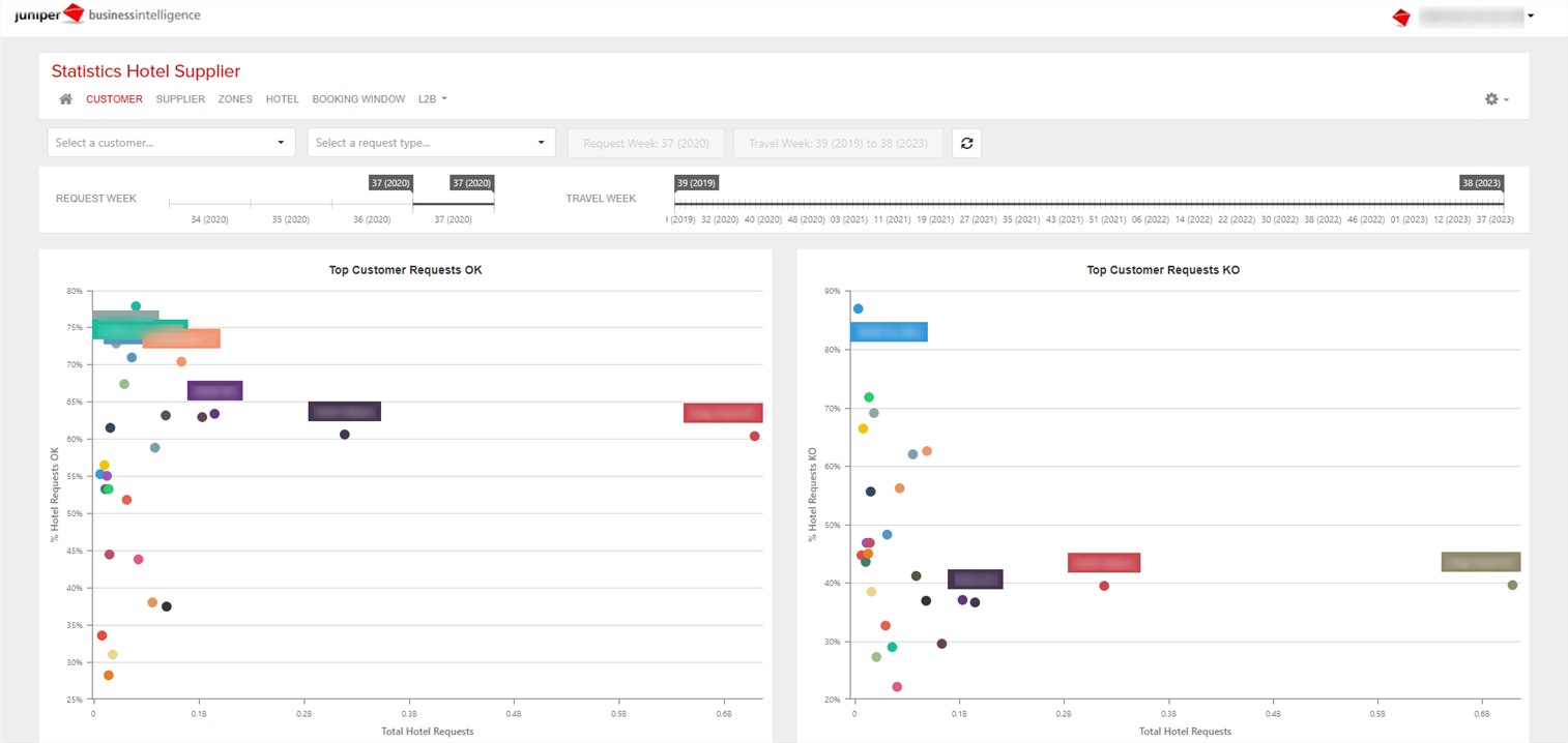
Tab 1: Customer
This report shows statistical information about requests made by agencies.
- Top Customer Requests OK: The chart shows the top 25 customers with the most total hotel requests and hotel requests OK. It shows, for each one, the percentage of hotel requests OK and the number of total hotel requests.
- Top Customer Requests KO: The chart shows the top 25 customers with the most total hotel requests and hotel requests KO. It shows, for each one, the percentage of hotel requests KO and the number of total hotel requests.
- Requests Hotel OK: Top 150 contries with the highest number of correct responses. By hovering over the country, you can see the total number of requests and the percentage of correct ones, as well as the top 10 suppliers with the highest percentage of correct requests.
- Requests Hotel KO: Top 150 contries with the highest number of incorrect responses. By hovering over the country, you can see the total number of requests and the percentage of incorrect ones, as well as the top 10 suppliers with the highest percentage of incorrect requests.

Tab 2: Supplier
Same information as in the previous report but referring to hotel requests to suppliers.


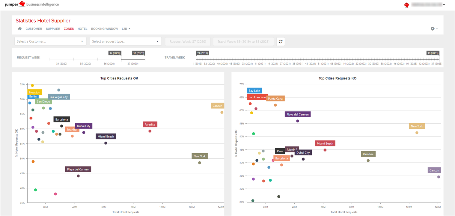
Tab 3: Zones
Information for the cities with the highest percentage of OK and KO requests.

Tab 4: Hotel
Same information as in the previous reports referring to hotel requested.


Tab 5: Booking Window
Total hotel requests information by travel week and percentage of correct and wrong requests.


Tab 6: L2B
This tab allows you to view the information related to the countries, cities/towns or hotels with the highest number of requests according to different criteria.
- Top Countries x Availability / Bookings Requests: countries with the highest number of availability requests per booking requests (it corresponds to the classic Look2Book).
- Top Countries x % Cancellation Requests vs Bookings: countries with the highest percentage of cancellation requests per bookings made.
- Top Countries x cancellation Policy / Bookings Requests: countries with the highest number of cancellation policy requests per booking requests.
- Top Countries x Availability / Cancellation Policy Requests: countries with the highest number of availability requests per cancellation policy requests.
The dashboards per cities/towns and hotels also appear in the same way as that of the countries mentioned above.
¶ Statistics API Service
This report shows statistical information about the flow of requests made to services. It has panels focused on different aims to monitor the traffic (response times, requests, errors, etc.).
From the top of each dashboard you have the possibility to filter by the desired client and, on the horizontal chronological axis, select the dates that interest you (holding down and dragging during the desired period).
You also have the possibility to activate the scroll of the graphics from the upper right by selectiong Settings > zoom, activate last week data by default, filter the data of a specific graphic by clicking on the desired values in the legend or use View Full Screen option clicking on the three horizontal lines located on top right side of the figure.
Tab 1: Summary
With this dashboard you can have an overview about the transfer requests made in the last months. It is created with the following graphics:
- Requests/Results Trend: total requests and total results by month.
- L2B Trend: total requests divided total booking requests.
- Data Transfer Trend: data transfer consumption by month.
- Availability Requests x Destination Zone: availability requests zone.
- Booking Requests x Destination Zone: booking requests zone.

Tab 2: Customer
Dashboard of requests by customer. It is composed of the following graphics:
- Response Time: response time of requests, in seconds range.
- Requests/Results x Customer: total requests and total results per each customer.
- Requests x Pax Requested: total requests depending on the number of pax. It is indicated with number of adults - number of children.
- Requests/Results x Hour: number of requests and results by hour.
- Data Transfer x Hour: data transfer consumption per hour.
- Top L2B x Customer: total availability requests divided booking requests from each customer.
- Requests x Destination Zone: requests destinations.


Tab 3: Customer errors
Dashboard of error requests by customer. It is created with the following graphics:
- Errors Type: total requests by each type of error.
- Errors Type x Hour: total error requests by hour.
- Errors Type x Customer: total error requests by error and by customer.
- Requests x Destination Zone: requests destination zone.

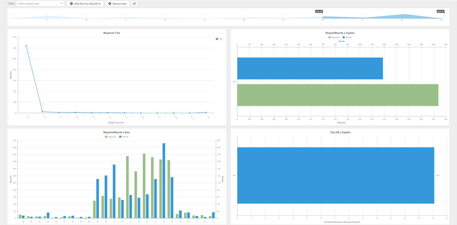
Tab 4: Supplier
Dashboard of requests by supplier. It is created with the following graphics:
- Response Time: response time of requests, in seconds range.
- Requests/Results x Supplier: total requests and total results per each supplier.
- Requests/Results x Hour: number of requests and results by hour.
- Top L2B x Supplier: total availability requests divided booking requests from each supplier.
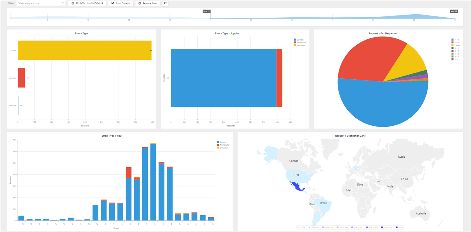
Tab 5: Supplier errors
Dashboard of error requests by supplier. It is created with the following graphics:
- Errors Type: total requests by each type of error.
- Errors Type x Supplier: total error requests by error and by supplier.
- Requests x Pax Requested: total requests depending on the number of pax. It is indicated with number of adults - number of children.
- Errors Type x Hour: total error requests by hour.
- Requests x Destination Zone: requests destination zone.
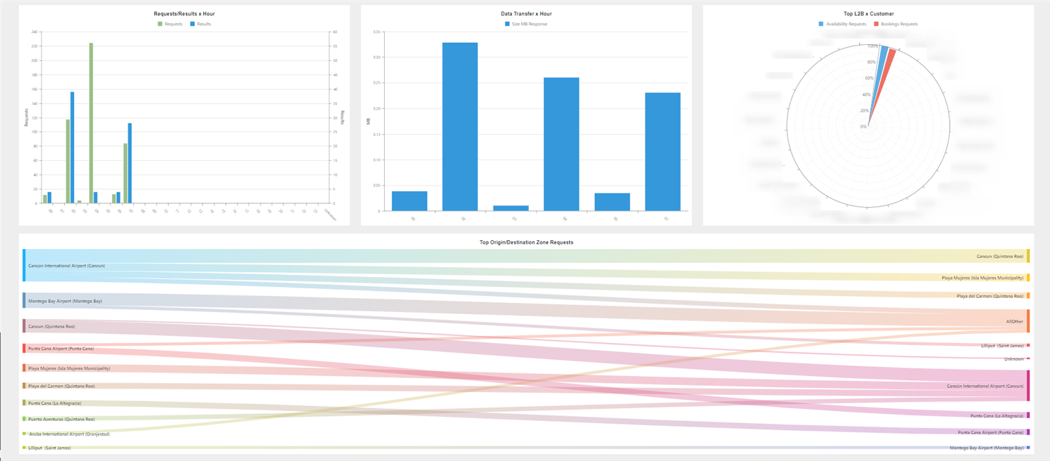
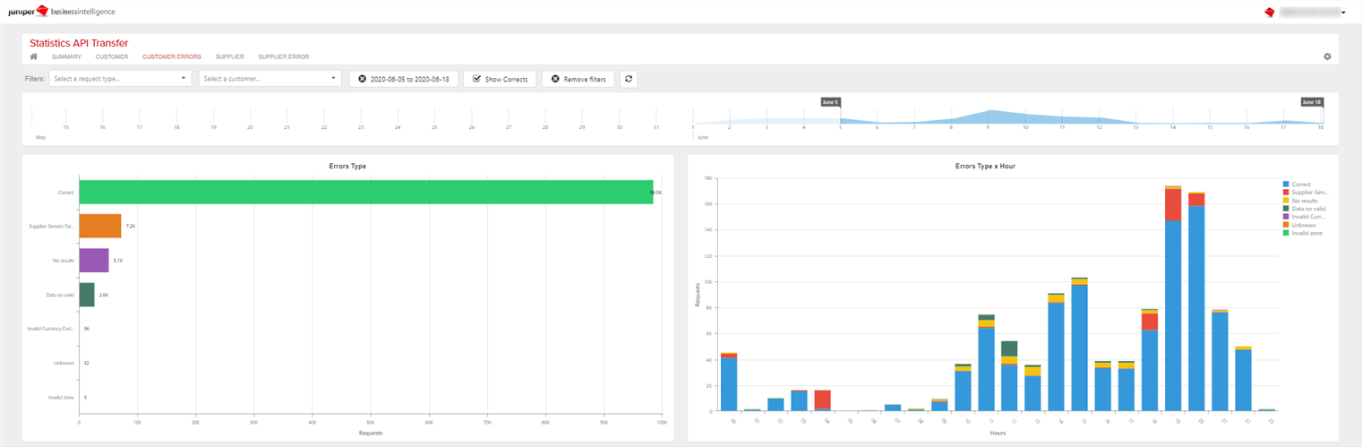
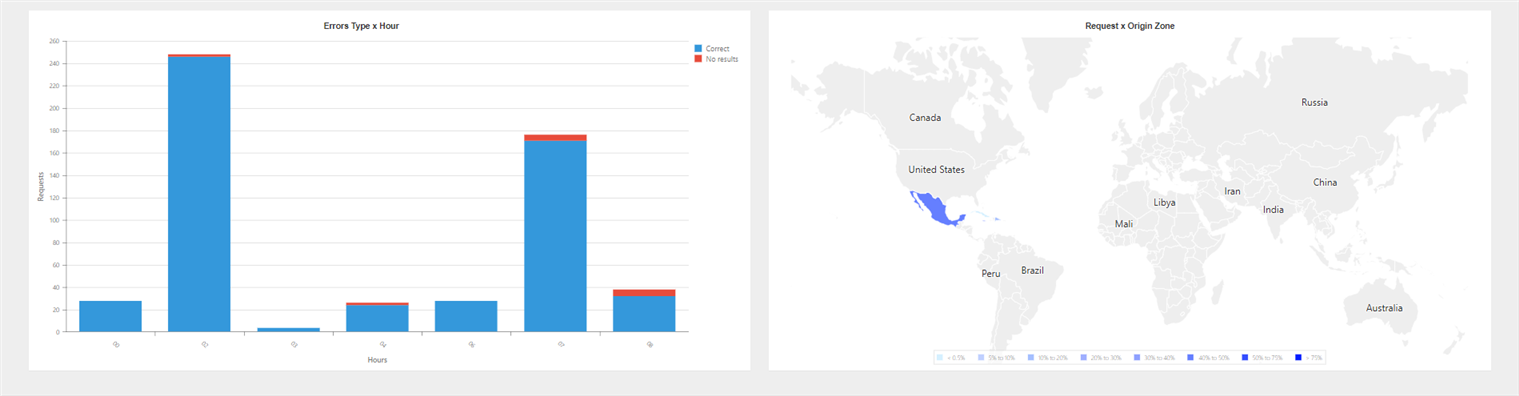
¶ Statistics API Transfer
This report shows statistical information about the flow of requests made to transfers. It has panels focused on different aims to monitor the traffic (response times, requests, errors, etc.).
From the top of each dashboard you have the possibility to filter by the desired client and, on the horizontal chronological axis, select the dates that interest you (holding down and dragging durint the desired period).
You also have the possibility to activate the scroll of the graphics from the upper right by selectiong Settings > zoom, activate last week data by default, filter the data of a specific graphic by clicking on the desired values in the legend or make use of View Full Screen option clicking on the three horizontal lines located on top right side of the figure.
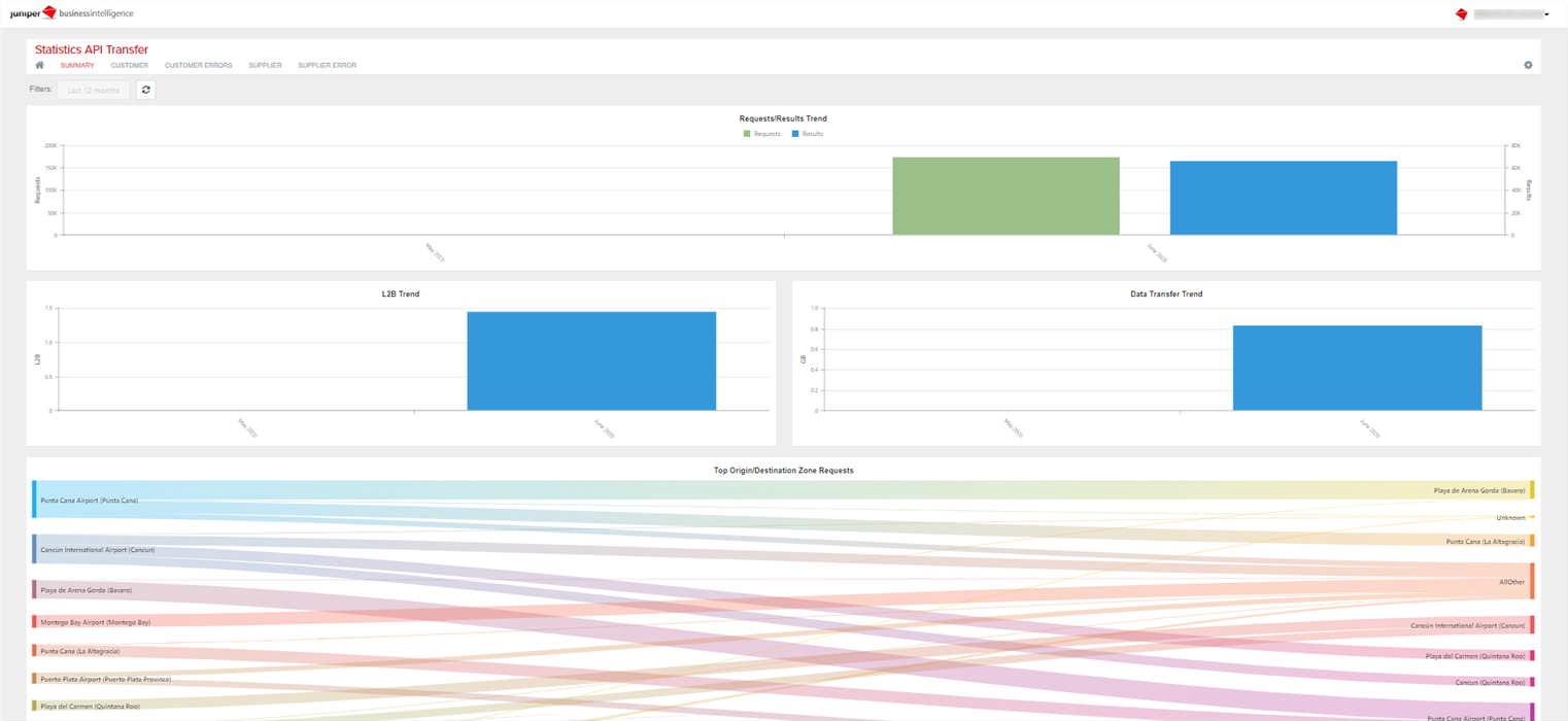
Tab 1: Summary
With this dashboard you can have an overview about the transfer requests made in the last months. It is created with the following graphics:
- Requests/Results Trend: total requests and total results by month.
- L2B Trend: total requests divided total booking requests.
- Data Transfer Trend: data transfer consumption by month.
- Top Origin/Destination Zone Requests: relation between top origin and top destinations. Selecting on an origin (or destination) you can see a breakdown of the destinations for that origin (or the origins for that destination).
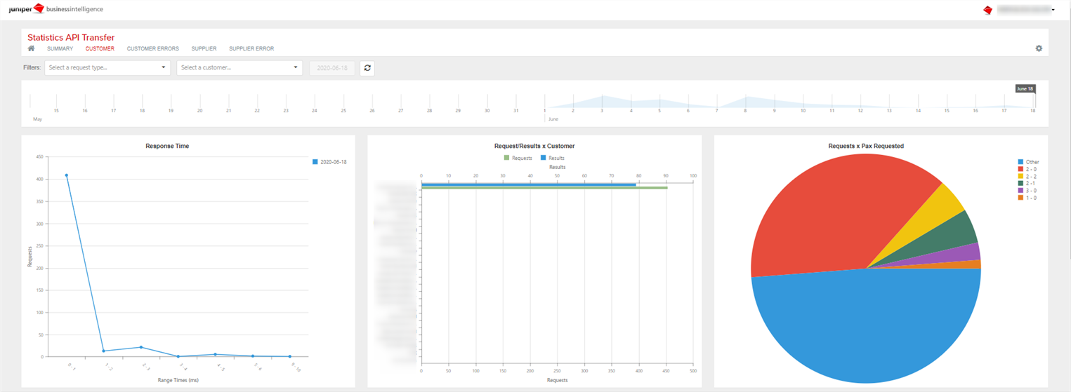
Tab 2: Customer
Dashboard of requests by customer. It is composed of the following graphics:
- Response Time: response time of requests, in seconds range.
- Requests/Results x Customer: total requests and total results per each customer.
- Requests x Pax Requested: total requests depending on the number of pax. It is indicated with number of adults - number of children.
- Requests/Results x Hour: number of requests and results by hour.
- Data Transfer x Hour: data transfer consumption per hour.
- Top L2B x Customer: total availability requests divided booking requests from each customer.
- Top Origin/Destination Zone Requests: relation between top origin and top destinations, disaggregated by customer.
Tab 3: Customer errors
Dashboard of error requests by customer. It is created with the following graphics:
- Errors Type: total requests by each type of error.
- Errors Type x Hour: total error requests by hour.
- Errors Type x Customer: total error requests by error and by customer.
- Requests x Origin Zone: requests origin zone.

Tab 4: Supplier
Dashboard of requests by supplier. It is created with the following graphics:
- Response Time: response time of requests, in seconds range.
- Requests/Results x Supplier: total requests and total results per each supplier.
- Requests/Results x Hour: number of requests and results by hour.
- Top L2B x Supplier: total availability requests divided booking requests from each supplier.


Tab 5: Supplier errors
Dashboard of error requests by supplier. It is created with the following graphics:
- Errors Type: total requests by each type of error.
- Errors Type x Supplier: total error requests by error and by supplier.
- Requests x Pax Requested: total requests depending on the number of pax. It is indicated with number of adults - number of children.
- Errors Type x Hour: total error requests by hour.
- Requests x Origin Zone: requests origin zone.

¶ Statistics Client Web
This report shows statistical information about the flow of requests made by the agencies from te Web interface. It has panels focused on different aims to monitor the traffic (response times, requests, errors, etc.).
From the top of each dashboard you have the possibility to filter by the desired client and, on the horizontal chronological axis, select the dates that interest you (holding down and dragging durint the desired period). You also have the possibility to activate the scroll of the graphics from the upper right by selectiong Settings > zoom, filter the data of a specific graphic by clicking on the desired values in the legend or make use of View Full Screen option clicking on the three horizontal lines located on top right side of the figure.
Tab 1: Response time
This dashboard focuses on monitoring the response time of the web interface. It is composed of the following graphics:
- Requests x Date: response time of requests per day.
- Requests x Product Type: response time according to the type of product requested.
- Requests x Request Type: response time according to the request type.
- Requests x Customer: response time of each client.

Tab 2: Requests
Dashboard of requests received by customers visible for hours. It has the same structure as the previous one.

Tab 3: Results
Dashboard of customers response breakdown by hours of the day. It has the same structure as the previous ones.

Tab 4: Zones
This dashboard shows information related to the requests received and the zones of the same. It is composed of the following graphics:
- Requests x Product Type: number of requests for each product type.
- Requests x Request Type: number of requests for each request type.
- Requests x Customer: number of requests send by each client.
- Requests x Origin Zone: origin of the requests made.
- Requests x Destination Zone: destination of requests made

Tab 5: Errors
Dashboard on errors processed with the same structure as the previous ones.

Tab 6: GB Usage
Dashboard on the GB consumed with the same structure as the previous ones.

Tab 7: Login
Information about customers who have accessed the system. The dashboard is composed of the following graphics:
- Top customers by Login Requests: representation of the logins made by each client.
- Requests Conversions: percentage of users who have followed the usual flow of the reservation.

Tab 8: L2B
This tab shows information related to the different phases of the booking process. The dashboard consists of the following charts:
- Top Customers x Availability / Bookings Requests: customers with the highest number of availability requests per booking requests.
- Top Customers x Cancellation Policy / Bookings Requests: customers with the highest number of cancellation policy requests per booking requests.
- Top Customers x Availability / Cancellation Policy Requests: customers with the highest number of availability requests per cancellation policy requests.

¶ Bookings Statistics
With this report you can know the response time of reservation requests as well as information about them.

On the following pages it is possible to view data of the reservations made during the selected period, as well as customer, interface, reservation locator, etc.

¶ Price Change Notifications
This report shows information about price changes that have occurred in the system, offering the option of breaking them down by customer, supplier or hotel, among others.
At the top you have some options to filter by supplier, customer or if you want to show only the price changes allowed. Selecting on the legend or on an area in the grphics, it is filtered by said information and the rest of the graphs are dynamically updated. Moreover, clicking on the three horizontal lines located on top right side of any graphic it displays the View Full Screen option, through wich you can view the graphic in full screen and a summary table of the data, including the option to download them. In the upper right part, from Settings > Zoom, you can activate the zoom mode which allows you to scroll the graphics with the mouse.
Tab 1: Summary
This dashboard shows an overview of price changes or the availability errors produced in the system.
If you filter by Price changes, the dashboard is made up of the following graphics:
- Changes & Requests Trend: evolution of the requests in the system and the price changes produced during the last weeks.
- Top Suppliers x Changes Trend: evolution of the suppliers with the greatest number of price changes in recent weeks.
- Top customers x Changes Trend: evolution of price changes returned to customers in recent weeks.

If you filter by Availability Errors, the dashboard is made up of the following graphics:
- Errors & Requests Trend: evolution of the requests in the system and errors produced during the last weeks.
- Top Suppliers x Errors Trend: evolution of the suppliers with the greatest number of errors in recent weeks.
- Top customers x Errors Trend: evolution of errors returned to customers in recent weeks.
Tab 2: Supplier
This dashboard provides an overview of the price changes returned by each supplier.
At the top of the dashboard, in addition to usual filters, a time axis is offered to be able to filter the desired dates.
El dashboard is made up of the following graphics:
- Supplier Price Changes: amount of price changes caused by each of the suppliers.
- Context Price Changes: context of requests that have caused a price change.
- % Changes Booking Rules: price changes percentage over the total booking rules requests.
- Supplier Price Change x Hour: price changes evolution per supplier according to the day hour.


Tab 3: Customer
This dashboard shows the same information as the previos one but broken down by customers.
El dashboard is made up of the following graphics:
- Customer Price Changes: amount of price changes caused by each of the customers.
- Context Price Changes: context of requests that have caused a price change.
- % Changes Booking Rules: price changes percentage over the total booking rules requests.
- Customer Price Change x Hour: price changes evolution per supplier according to the day hour.


Tab 4: Hotel
This dashboard shows information about the hotels that have had the highest volume of price changes.
El dashboard is made up of the following graphics:
- Top Hotel Changes: hotels with the highest price changes volume.
- Top Hotel % Changes: hotels with the highest price changes percentage over total requests.

¶ Statistics Channel Manager API
This report shows statistical information about the Channel Managers who have pushed on your system.
The first three tabs present the same charts; the only difference lies on the time breakdown. The indicators are defined below:
- Top Integrators x AVG Response Time: Response time of the requests.
- Requests: Quantity of requests.
- Top Integrators x Errors: Errors per integrator.
- Top Integrators x Warnings: Warnings per integrator.
- Requests x Request Type: Requests per request type.
- Requests x Integration Type: Requests per integration type to Juniper.
Tab 1: Hour Summary
This dashboard shows the indicators broken down by time and Channel Manager.

Tab 2: Daily Summary
This dashboard shows the indicators broken down by day and Channel Manager.

Tab 3: Weekly Summary
This dashboard shows the indicators broken down by week and Channel Manager.

Tab 4: Integrator
This tab provides you a dashboard destined to specific views of each Channel Manager. In this case, the temporality comes from filters and the data shown on the charts are added from the whole period selected.
-
Top Integrators x Requests: Quantity of requests received per Channel Manager. When placing the mouse over the bars of each one, you will see the percentage of right responses.
-
Top Integrators x Errors: Quantity of requests containing an error per Channel Manager. If you wish to see the error breakdown, place the mouse over each side bar.
-
Top Integrators x Bookings: Quantity of bookings per Channel Manager.
-
Top Integrators x Hotels: Quantity of hotels requested per Channel Manager. If you wish to see the percentage of right responses, place the mouse over the side bars.

Pestaña 5: User
This tab presents a dashboard destined to specific views of each User. In this case, the temporality comes from the filters and the data displayed in the charts are added from the period selected.
-
Top Users x Requests: Quantity of requests sent per User. When placing the mouse over the bars of each one, we can see the percentage of right responses.
-
Top Users x Errors: Quantity of requests containing an error per User. If you wish to see the error breakdown, place the mouse over each side bar.
-
Top Users x Bookings: Quantity of bookings per User.
-
Top Users x Hotels: Quantity of hotels requested per User. If you wish to see the percentage of right responses, place the mouse over the side bars.

Tab 6: Error Breakdown
This tab allows you to see in detail the errors under different views. Once again, the temporary breakdown is not visible but we have a filter bar to select the period.
-
Top Error Type x Errors: Quantity of errors broken down by error type. If you wish to see the percentage that represents each bar, place the mouse over it.
-
Top Integrators x Errors: Quantity of errors broken down by Channel Manager. If you wish to see the percentage it represents over the total, place the mouse over it.
-
Top Users x Errors: Quantity of errors broken down by User. If you wish to see the percentage it represents over the total, place the mouse over it.
-
Top IPs x Errors: Quantity of errors broken down by IPs. If you wish to see the percentage it represents over the total, place the mouse over it.
-
Errors x Integration Type: Circle diagram that represents the errors per integration type. To see the breakdown, place the mouse over each portion.
-
Errors x Request Type: Circle diagram that represents the errors per request type. To see the breakdown, place the mouse over each portion.

Tab 7: Warning Breakdown
-
Top Warnings Type x Warnings: Quantity of warnings broken down by warning type. If you wish to see the percentage that represents each bar, place the mouse over it.
-
Top Integrators x Warnings: Quantity of warnings broken down by Channel Manager. If you wish to see the percentage that it represents over the total, place the mouse over it.
-
Top Users x Warnings: Quantity of warnings broken down by User. If you wish to see the percentage that it represents over the total, place the mouse over it.
-
Warnings x Request Type: Circle diagram that represents the warnings per request type. To see the breakdown, place the mouse over each portion.
-
Warnings x Integration Type: Circle diagram that represents the warnings per integration type. To see the breakdown, place the mouse over each portion.
